


Beyond Emojis: How to Visualize Your Area Scorecard Metrics

I liked the recent Catalysis blog post on “How to Create an Area Scorecard,” but I’d like to use this blog post to build upon the helpful thoughts that were shared there.
The previous blog post focused on the important question of “what should we measure?” The recent book Measure What Matters by John Doerr has been popular with readers in many industries, even though the roots are from Silicon Valley. Healthcare organizations have an incredibly powerful “true north” (as we’d say in the Lean approach) that includes safety for patient and staff, quality and outcomes, timely access to care, staff morale, and cost.
There are dozens or hundreds of things we could measure related to our own personal health, and the same is true with measures of organizational health. We also ask, “What is the gap between actual performance and ideal performance?” It’s possible to prioritize the metrics we are focused on, based on where the performance gaps are the largest or the most meaningful. Is a gap in patient safety more important than a gap in appointment waiting times? Having more measures doesn’t necessarily lead to more improvement. Having too many measures can distract us from working on what matters most.
We can likewise prioritize by choosing a relatively small number of key performance indicators for our organization as a whole, or for our part of it. Remember that the K in the KPI acronym means “Key” not “Ka-jillion.” Can you evaluate your health based on four or five key metrics that are appropriate to you? Probably. The same is true for organizations.
But once we select a small number of things measure (what and how to measure it), we’ve eliminated the distraction of looking at too many metrics. But what about the distraction that comes from reacting too much to said metrics?
The previous blog post that I referenced talked about making measures visual. This was in the context of listing how many metrics we currently have. The resulting scorecard should indeed be visual. I’d like to explore more deeply what “visual” means since not all visuals are created equal.
I’m teaching a workshop at the 2020 Lean Healthcare Transformation Summit that shares a title with my most-recent book: Measures of Success: React Less, Lead Better, Improve More, where we’ll explore the best ways to visualize performance metrics and the best ways to react (or not react) to changes in those metrics.
Healthcare organizations often visualize metrics by writing the most recent data point on a team whiteboard. Yes, a single data point. There might be a comparison against the goal. A single data point, one that’s literally erased each day, week, or month, doesn’t tell us anything about trends in the metric (unless the team and leader remember past performance – we shouldn’t rely on such memory). A single data point might be written in red or green marker, to signify if the metric is better or worse than the target in a very binary good/bad way. The color coding does save us from having to do the math in our heads, but what about those who are red/green colorblind?
In my travels over the past year, I saw healthcare organizations in the U.S., Europe, and Brazil that put emojis on their metrics board, again signifying only if that data point is better or worse than the goal. Well, that does help for those who are colorblind.
And, there’s a whole range of emojis that can specify more than a binary bad or good. The emojis can imply the degree to which we’re better than or worse than the goal. But is this the best way?
Sometimes these emojis are even color coded, as shown in the photo below from a European hospital:
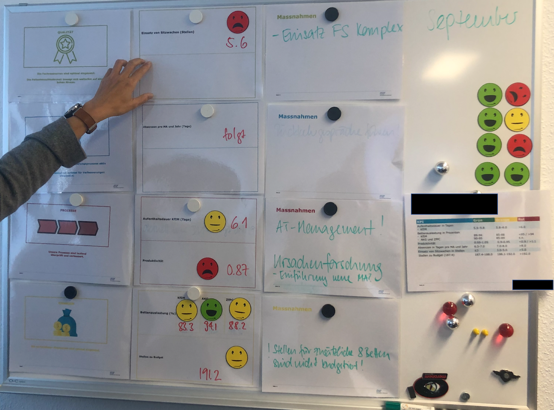
A written number, colors, and emojis are visual – but are they helpful? If we’re reacting to single data points, I’d argue none of that is helpful.
If one data point is not a trend, what about two? Probably not helpful. Three? No, that also makes it hard to detect meaningful trends or to determine if we’re improving or not.
As I blogged about a year ago for Catalysis, a so-called “Bowling Chart” (a long list of numbers, which might include red/green color coding) might not be the most helpful way to visualize numbers. Yes, It’s visual, and it’s better than a single data point. But a long list of numbers makes it very hard for us to see trends. A list of numbers won’t help us by answering these three questions:
- Are we achieving our target or goal?
- Are we improving?
- How do we improve?
We’ll discuss this in my workshop, and more.
We’ll also learn a method (see the previous blog post) that I think should be considered a “best practice” when it comes to visualizing metrics – the “Process Behavior Chart” or PBC, for short. It’s a specialized form of “control chart” or “Statistical Process Control (SPC)” chart.
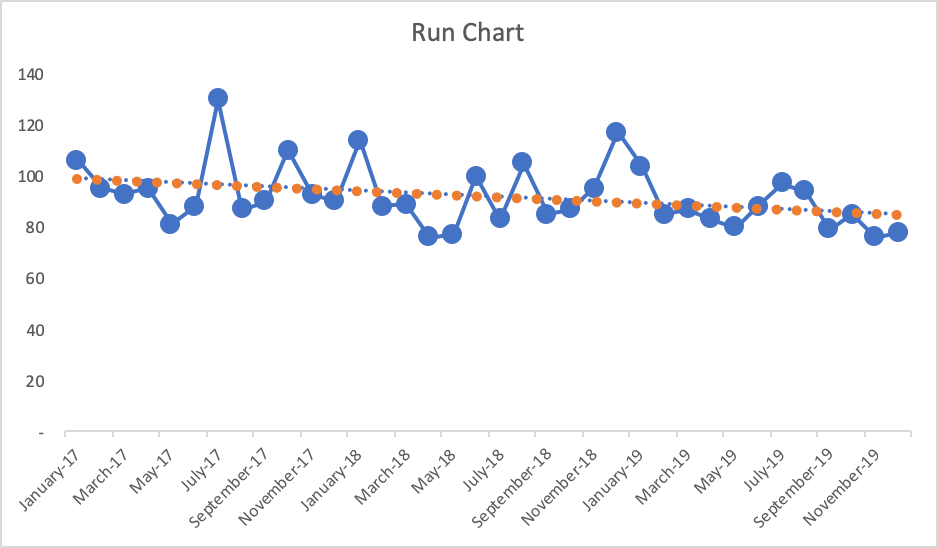
The PBC is built upon a Run Chart that shows the data over a longer period of time (at least 20 points ideally). A Run Chart alone is great since it’s more visual than a list of numbers. But, the PBC goes a step further by adding three other helpful horizontal lines: a calculated average and calculated “lower and upper limits” for the chart.
Let’s compare these approaches to making the metric visual (and lower is better here for this metric):
- List of Numbers:
It’s tempting (and common behavior) for managers to ask, “Why was October higher than September?” There might not be a good answer (or a root cause) that explains the month-to-month change. Managers might also say, “Hooray, the last two months have improved! I like this trend!” But is that a statistically meaningful change in performance that should be celebrated? Or is the number just fluctuating around an average?
Would it help us to color code those numbers against a target? If the number is always red, then we clearly need to improve. If the number is always green, should we stop thinking about improvement? What if the target was so low that it was not challenging?
What if the goal was 95, so that number was sometimes red and sometimes green? It might not be helpful to react to every red (or two consecutive reds, or whatever rule of thumb you might have) by demanding a root cause analysis. There might not be a root cause for why one number is worse than another or why the number is red for a single month.
- Run Chart
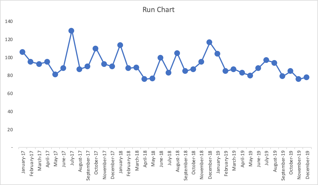
With the more-visual Run Chart, we have a fighting chance of processing the information in a way that might make us ask if there is a trend, a clear shift in performance, or if it appears to just be fluctuating over time. If you’re not using the full-blown Process Behavior Chart methodology, Run Charts (in my rough estimation) provide about 80% of the benefit of Process Behavior Charts. The one problem with Run Charts, though, is that you end up guessing – does that data point seem like an outlier? Is there really a statistically meaningful trend?
If the goal is, again, 95, what does the chart tell us if we draw that in as a horizontal line? The last few data points would be green (or would have a smiley face, perhaps). Does that mean we have really improved? Has the system really changed?
Also, linear trend lines are easy to add (in Excel and other software), but they can be misleading – mathematically correct but misleading. The linear trend line for the Run Chart here would be headed downward (in a good direction). The linear trend line may, incorrectly, lead the manager to believe that performance will inevitably continue to fall just by letting time play out. This might not be true.
- Process Behavior Chart:
A PBC filters out “noise” in a metric (also known as “routine variation”) so we can identify any “signals” (“extraordinary variation”) that might exist in the chart. When we see “noise,” those data points are the product of the same system that has remained unchanged in any meaningful way. “Signals” show us when there is a statistically-meaningful change in the results, which means the system has changed – and we should make sure we understand what changed.
There is no root cause for noise, but we can identify a root cause (or a “special cause”) for a signal in our chart. The system change could have been something that we did as an organization, or it could be due to an outside factor that’s out of our control.
The three main rules for finding a signal are:
- Any single data point that’s outside the limits
- Eight consecutive data points that are on the same side of the average
- Three consecutive (or three out of four) data points that are closer to the same limit than they are to the average
These rules are visual and they are also math-based. When we signal, it’s very unlikely that it’s a randomly occurring result in the existing system. Again, it says the system has changed.
Here is what the PBC looks like, below, with an average and the lower and upper limits being calculated from all 37 baseline data points that are shown below.
What do we see?
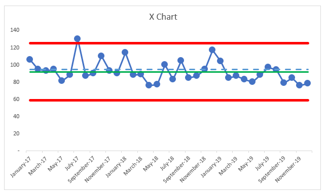
The average performance (the green line) is 92. Again, if the goal is 95 (the blue dashed line), do the data points that are better than the goal really indicative of sustainably improved performance? No. The same system that sometimes generates 120 as a data point will sometimes also generate a data point of 85. This is part of the built-in variation that exists in the system that leads to that metric.
The three PBC rules show us there is nothing but “noise” in that chart, except for the July 2017 data point – the one that’s above the upper limit. It is appropriate to ask a question like, “What went wrong that month?” Whatever happened seemed to have a strong (and negative) effect that was short lived. Was there a problem that was solved by the organization? Or was there some external factor that went away for some reason?
It’s often hard to answer these questions when the data point was from years ago. That’s one reason to update and look at PBCs on an ongoing basis – the more quickly that we detect signals, the quicker we can be in improving our understanding of the system.
If we had a positive signal (a data point below the lower limit, or eight in a row below the average here), we’d want to make sure we understood what changed so that new system could be locked in as a way to ensure continued improved performance.
In PBCs like this, we quite often see step-function improvements as the result of an improvement activity, even if we aim for continuous improvement. It’s possible that a large number of small improvements could lead to continued improvement to the metric over time – and maybe that linear trend line would be an accurate portrayal of the system over time. But, we can’t take continued improvement for granted… we have to keep working at it.
Back to the chart, there’s no other single data point where leaders should ask questions like:
- What happened?
- What changed?
- What was the root cause of that change in performance?
But it’s very tempting for leaders to ask these questions based on every increase or for every above-average data point. Likewise, celebrating every decrease or every below average point really isn’t worth the effort, either.
If you find this interesting, we’ll, again, explore all of this more in my pre-Summit workshop. We’ll learn how to create PBCs and, more importantly, we’ll learn how to interpret them in ways that help us:
- Discover signals in our metrics
- Better evaluate the impact of improvement efforts, especially with projects, Rapid Improvement Events, and the like.
We’ll also do the famed “Red Bead Experiment” that was popularized by W. Edwards Deming. That exercise is used by Dr. Don Berwick and others and I facilitate as a way to learn more about natural variation in a system (separating signals from noise) and it’s also a fun and unthreatening way to reflect on some common management methods.
If you like this approach, the workshop will help you join other health systems (including some Healthcare Value Network members) that are adopting PBCs as their new default way of displaying and evaluating metrics – they are reacting less, leading better, and improving more as a result.
Related Items
Measures of Success workshop
Lean Healthcare Transformation Summit
Catalysis Healthcare Value Network


Leave a Reply