Being Open to Learning and Using Process Behavior Charts Means Unlearning Something Else
Why don’t people adopt best practices? I get asked this question a lot. What are some of the possible answers? Sometimes, it’s as simple as people not being aware of the better way. You can’t blame people for not adopting something they haven’t been taught.
Other times, people just get really anchored in the way they were taught to do something. That’s sometimes a variation of “the way we’ve always done it” or they might have been taught a new practice last year. People probably won’t try something new unless they see a problem with the way they’re currently doing it. Or, it might be politically risky to scrap something you just implemented. Either way, the human mind seems to favor the certainty of suboptimal performance over the risk of trying a new way that might not work.
There’s a long history of best practices being slowly adopted in healthcare, such as stethoscopes and antisepsis methods — I highly recommend reading Dr. Atul Gawande’s great article on that.
We can do better, though, than simply blaming others for being “resistant to change” — and that also applies to changes like adopting Lean or the “Process Behavior Chart” method that I’ll again be teaching at the Lean Healthcare Transformation Summit (and also write about in my book Measures of Success: React Less, Lead Better, Improve More)
Many people just haven’t been exposed to Process Behavior Charts as a method for managing performance metrics and improvement efforts. Again, I can’t blame people for not trying something they don’t know about.
But, again, people get really anchored in something that was taught to them, especially if it was taught by an “expert” (and even more so if it’s an expert that you’ve paid for).
When I first learned about Lean, in college, my professor (an expert) basically taught about Just-in-Time, kanban, and flow. Nothing he taught was incorrect — it was just incomplete. Thankfully, I was open to learning more when I entered the workforce and met new experts. When people are taught, say in a Lean Six Sigma class, that Lean is all about 5S and Value Stream Mapping, it can sting when they’re exposed to a more complete view.
I run across this a lot with the word “Kaizen,” when people say “a Kaizen” as shorthand for “a Kaizen Event” (or whatever term you use). Many organizations were taught by a consultant that Rapid Improvement Events are the way to improve. I think it’s fair to say that “a Kaizen Event” is just one form of Kaizen — a more complete approach includes “daily Kaizen” and “A3 problem solving.”
Years ago, when Joe Swartz and I wrote Healthcare Kaizen, we were trying to reach and influence organizations that were only doing events. Why weren’t some organizations trying to engage everybody in daily Kaizen? Well, many of them had never been taught about that possibility and methods for doing that. Now, it’s far more common to see organizations use a mix of events, daily Kaizen, A3s, Toyota Kata, and other related methods instead of assuming one size fits all. I’d like to think our book played a part in that progression.
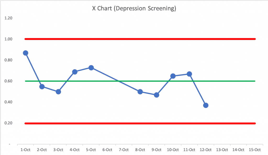
OK, back to “Process Behavior Charts.” You might not have heard about this method. It’s not new — it comes from proven “Statistical Process Control” methods that date back to the early 20th century. Process Behavior Charts look like the chart below, where we plot data as a run chart, and then also chart the average (in green), along with two other lines — the calculated “Lower and Upper Natural Process Limits” (shown in red). For more about this method, check out the webinar that I did for the Catalysis Healthcare Value Network.
I think Process Behavior Charts are far superior to tables of numbers, “bowling charts,” and simple run charts with linear trend lines. But, I don’t see them used very often. I was fortunate to have been taught about this method early in my career and I’ve found it very useful — and I don’t blame others who haven’t been taught this.
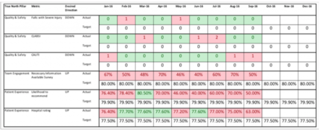
But again, one challenge is that many people have been taught that “bowling charts” with red and green color coding (for being worse or better than a target, respectively), are the “Lean” way to do metrics. Many Lean organizations do this, but it doesn’t mean it’s the only way or the best way. See an example below:
People are often quite strongly anchored in this approach. They might say, “I paid an expert who taught me that” or add, “We just rolled those out organization wide… we can’t admit there might be a better way.”
I’ve gotten reports from some who have taken my workshop and/or have read my book and they’ve taken baby steps to introduce Process Behavior Charts alongside bowling charts. They don’t have to make anybody feel bad for using the method they were taught before… but, hopefully, leaders will reach their own conclusion that Process Behavior Charts are a better way to answer these important questions:
- Are we achieving our target or goal?
- Are we improving?
- How do we improve?
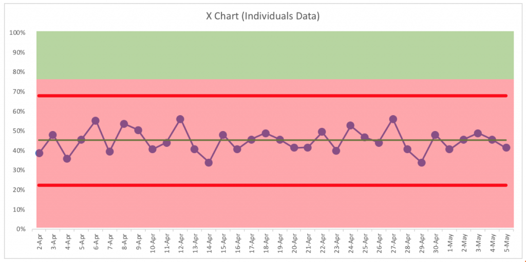
Bowling charts make the answer to #1 somewhat clear, but it’s nearly impossible to see trends the way you can in a Process Behavior Chart. And, if you add your goal line to a Process Behavior Chart, as shown below, it answers questions #1 and #2 very clearly.
In that chart, we can ask and answer our questions: Are we achieving our target or goal? No. Never. Are we improving? No, we are just fluctuating around a stable and predictable average.
That leads us to the final question: How do we improve?
Process Behavior Charts teach us a number of management lessons. For one, when we react to “noise” in a metric (for example, asking for an explanation of every data point that’s lower than before), we end up wasting time. There is no single “root cause” for noise in a metric. Process Behavior Charts teach us how to find a “signal” that there’s been a significant change to our system, for better or for worse. A signal is worth understanding, explaining, or reacting to.
When we have a fluctuating metric like the one above, we need to improve performance in a systemic way (such as doing an A3). That’s going to be more effective than the reactive approach of asking why any particular data point is what it is… over and over again.
So, in our final challenge… even if leaders accept Process Behavior Charts, they are still often very anchored in the idea that leaders need to constantly react to all of the noise in the metric, asking for root causes that don’t exist. That action might feel good (we’re doing something), but it might be the wrong action and the wrong questions for that point in time.
If you view me as an “expert,” what happens when what I’m teaching and suggesting comes into conflict with other experts you have learned from? Quite often, people stick with the status quo.
But, I hope you’re inspired to learn more about Process Behavior Charts through my workshop or my book. I think we can also have a rich discussion about change management here, related to any sort of organizational change.
Mark Graban, Faculty
Catalysis
Related Items
Measures of Success workshop
Book: Measures of Success by Mark Graban





Leave a Reply